Branding and exhibition stands from the 1920s to 1940s

1920s-1940s: Branding Takes Over

A History of Trade Shows

By the interwar years, companies were no longer satisfied with simply placing products on a stand. Exhibition spaces increasingly used large names, architecture, lighting and coordinated layouts to make the brand itself impossible to miss.

The company name becomes part of the architecture

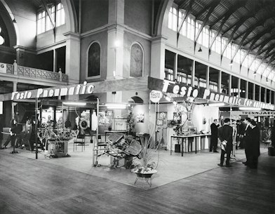
Early specialist trade shows had already introduced labelled stands and manufacturer names, but during the 1920s and 1930s branding became much more deliberate.

A stand could now be recognised from across the hall. Company names were enlarged, mounted above structures or integrated directly into façades. Counters, lighting, decorative shapes and display furniture were designed as one coordinated environment.

The product still mattered, but the exhibitor increasingly wanted the visitor to remember who made it.

That shift mirrors the wider growth of modern advertising. London's 1920 International Advertising Exhibition was promoted with a poster featuring established commercial characters and trademarks including Bibendum, Johnnie Walker and the Kodak Girl. Brands were becoming visual identities in their own right.

View the 1920 International Advertising Exhibition poster at the Library of Congress

The stand becomes a branded environment

Logos get bigger because competition gets harder

As specialist fairs grew, exhibitors faced a simple problem: everyone in the hall was competing for the same visitor's attention.

That encouraged clearer visual hierarchy. A company name needed to be visible above the crowd. Key products needed to be placed where visitors could understand them quickly. Counters created a defined point for conversation. Demonstration areas gave sales teams somewhere to explain more complex products.

The stand therefore began to perform several jobs at once:

  • identify the company;

  • attract attention;

  • present products;

  • explain what made them different;

  • create somewhere for sales conversations.

Those are still the core functions of a modern exhibition stand.

Corporate pavilions push branding even further

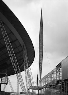
The 1939 New York World's Fair took corporate display far beyond the conventional booth. Wikimedia Commons records separate company pavilions for organisations including AT&T, DuPont, Firestone, Ford, General Motors, Kodak and RCA.

These were not neutral buildings with company names attached afterwards. The architecture, attractions and visitor journey were designed around the organisation's message.

General Motors' Futurama is the best-known example. The pavilion presented a dramatic vision of future roads and cities, associating the company with progress and technological optimism rather than simply showing individual cars.

This is the point where exhibition design starts to resemble experiential brand marketing.

A stand can tell people not only what you sell, but what kind of company you want them to believe you are.

Explore company pavilions from the 1939 New York World's Fair)

Display design becomes a specialist skill

The growing complexity of exhibition spaces created room for dedicated display designers, decorators and architects. Smithsonian photographs from the 1920s and 1930s document branded exhibition booths and specialist display designers creating increasingly sophisticated product environments in Paris.

The change is important because presentation is no longer an afterthought handled once the product arrives. It becomes something planned in advance.

Companies now have to think about:

  • visual identity;

  • layout;

  • visitor movement;

  • lighting;

  • signage;

  • product grouping;

  • demonstration space;

  • sales interaction.

The exhibition stand is becoming a designed communications tool.

See the Smithsonian's c.1927 Decca exhibition booth

What happened in the 1940s?

The Second World War interrupted normal exhibition activity across much of Europe and elsewhere. Exhibition halls were repurposed, international travel collapsed and industrial production shifted towards wartime priorities.

So '1920s-1940s' should not be read as a continuous period of trade-show expansion. The strongest visual development happened during the interwar years, particularly the 1920s and 1930s.

What survived the disruption was the idea that a company's physical environment could communicate its brand. When exhibitions expanded again after the war, that principle became even more important.

Why this period matters to exhibition history

By the late 1930s, the modern branded stand is clearly recognisable:

  • Company names dominate the space.

  • Architecture distinguishes one exhibitor from another.

  • Counters create dedicated sales areas.

  • Products are arranged as part of a designed composition.

  • Lighting and graphics shape visitor attention.

  • Large brands build entire pavilions around a message.

The exhibition stand has changed from somewhere a company happens to occupy into a temporary version of the company itself.

That is the foundation of modern exhibition branding.

Sources & further reading

Image licensing

The Fyffes photograph by Gustaf Wernersson Cronquist is released under CC0 1.0 by the Swedish Centre for Architecture and Design. The Officine Prevost photograph by Attilio Prevost is licensed CC BY-SA 4.0 with permission confirmed through Wikimedia's VRT system.

Historical note

This page uses the 1920s-1940s as a broad design phase. Exhibition growth was heavily disrupted by the Second World War, so the strongest evidence for the branding shift comes from the interwar period rather than the war years themselves.

Explore More History