Trustpilot - Rated Excellent
 Newsletter
Every day, people are exposed to thousands of visual messages. Shop signs, billboards, promotional displays, wayfinding systems, digital screens, exhibition graphics, and point-of-sale materials all compete for attention in increasingly crowded environments.
Despite this constant visual competition, some signs seem to attract attention effortlessly while others fade into the background. The difference often has less to do with luck and more to do with psychology.
Effective signage is not simply about displaying information. It is about understanding how people think, process visual stimuli, make decisions, and navigate environments. The most successful signs work because they align with human behaviour, guiding attention and influencing actions in subtle but powerful ways.
Whether in retail settings, exhibitions, corporate environments, or public spaces, understanding the psychology behind signage can help businesses communicate more effectively and create stronger customer engagement.
Why Signage Matters More Than Ever
Modern consumers are constantly filtering information.
From social media notifications and online advertising to in-store promotions and environmental distractions, attention has become one of the most valuable resources businesses compete for.
Signage serves a unique purpose because it reaches people in physical environments where purchasing decisions, interactions, and behaviours often occur.
A well-designed sign can:
Capture attention
Communicate information quickly
Reinforce branding
Influence movement
Encourage action
Improve customer experiences
Poor signage, on the other hand, may be completely overlooked regardless of how important the message is.
Understanding why people notice certain signs and ignore others is the foundation of effective design.
The Human Brain Is Built to Filter Information
One of the biggest challenges facing any sign is overcoming selective attention.
The human brain receives enormous amounts of sensory information every second. To avoid becoming overwhelmed, it automatically filters much of that information out.
This means people rarely process every visual element around them.
Instead, the brain prioritises information that appears:
Relevant
Important
Familiar
Unusual
Easy to understand
Signs that align with these priorities stand a much better chance of being noticed.
Those that require excessive effort to interpret often disappear into the background noise.
This explains why simplicity is frequently more effective than complexity when designing signage.
First Impressions Happen Almost Instantly
Research into visual perception consistently shows that people form impressions extremely quickly.
When someone encounters a sign, they often decide within seconds whether it deserves further attention.
This initial judgement is influenced by factors such as:
Colour
Contrast
Layout
Size
Positioning
Visual clarity
If a sign appears confusing, cluttered, or difficult to read, many viewers will move on before processing the actual message.
Effective signage acknowledges this reality by communicating key information immediately.
The best signs do not ask viewers to work hard.
They make understanding effortless.
The Power of Colour Psychology
Colour is one of the most influential elements in signage design.
Different colours trigger different emotional and psychological responses, helping shape how messages are perceived.
For example:
Red
Often associated with urgency, excitement, energy, and action.
Blue
Commonly linked to trust, professionalism, reliability, and stability.
Green
Frequently connected to nature, health, sustainability, and growth.
Yellow
Associated with optimism, attention, warmth, and positivity.
Black
Can communicate sophistication, luxury, authority, and elegance.
Of course, colour psychology is not an exact science. Cultural influences, context, and audience expectations all play important roles.
However, thoughtful colour selection can significantly improve the effectiveness of signage by reinforcing the intended message.
Why Contrast Is Essential
Many businesses focus heavily on colour choices while overlooking contrast.
Contrast determines how easily information can be read.
High contrast between text and background improves visibility, especially from a distance.
For example:
Black text on a white background
White text on a dark background
Bold colours paired with neutral tones
Poor contrast creates visual strain and reduces readability.
Even beautifully designed signs can become ineffective if viewers struggle to distinguish the message from its surroundings.
The easier information is to process, the more likely people are to engage with it.
The Role of Visual Hierarchy
People do not absorb all information simultaneously.
Instead, they scan visual content in a predictable sequence.
Visual hierarchy determines which elements attract attention first and how viewers move through a design.
Effective signage guides the eye naturally by prioritising information.
Typically, viewers notice:
Headlines
Images
Key messages
Supporting information
Calls to action
This structured approach reduces cognitive effort and improves comprehension.
Understanding the role of design in customer engagement often begins with recognising how visual hierarchy influences attention and decision-making.
When hierarchy is clear, communication becomes significantly more effective.
Why Simplicity Wins
Businesses frequently make the mistake of trying to communicate too much information at once.
The result is often visual clutter.
Cluttered signs compete against themselves for attention.
When viewers encounter excessive text, multiple messages, or overcrowded layouts, they may simply disengage.
Psychologically, people prefer information that is easy to process.
Simple signage offers several advantages:
Faster comprehension
Better recall
Stronger visual impact
Improved readability
A concise message often achieves more than several paragraphs of information.
The objective is not to say everything.
It is to communicate the most important thing clearly.
The Influence of Positioning and Eye Movement
Where a sign is placed can be just as important as what it says.
Humans naturally scan environments according to predictable patterns.
Eye-level placement remains particularly effective because it aligns with natural viewing behaviour.
Signs positioned too high, too low, or outside typical sightlines often receive less attention regardless of their quality.
Environmental context also matters.
Effective signage considers:
Customer movement patterns
Viewing distances
Entry points
Traffic flow
Potential visual obstacles
The goal is to position messages where people are already looking rather than forcing them to search.
Familiarity Builds Trust
People are naturally drawn to things that feel familiar.
Psychologists refer to this as the mere exposure effect.
The more often individuals encounter a visual element, the more positively they tend to perceive it.
Consistent signage helps reinforce familiarity through:
Repeated branding
Consistent colours
Recognisable logos
Uniform typography
Cohesive messaging
Over time, this familiarity can strengthen trust and improve brand recognition.
Businesses that maintain visual consistency across locations and marketing materials often benefit from stronger customer recall.
Emotional Responses Influence Behaviour
Many purchasing decisions are influenced by emotion, even when consumers believe they are acting rationally.


Many purchasing decisions are influenced by emotion, even when consumers believe they are acting rationally.
Signage can trigger emotional responses through:
Imagery
Colour
Language
Design style
Environmental context
For example, a luxury retailer may use elegant typography, minimalist layouts, and premium materials to create feelings of exclusivity.
A family-focused business may use warm colours and friendly imagery to create comfort and approachability.
The emotional tone of a sign often influences how the entire brand is perceived.
Signage and Memory Retention
Attracting attention is only part of the challenge.
The most effective signs are also memorable.
Memory retention improves when information is:
Visually distinctive
Emotionally engaging
Easy to understand
Relevant to the audience
Simple messages often outperform complex ones because they are easier to recall later.
This is particularly important in competitive environments where customers encounter multiple brands in a short period.
A memorable sign continues working long after the initial interaction.
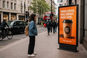
The Psychology of Illuminated Displays
Lighting introduces another important psychological dimension.
Illuminated displays naturally attract attention because humans are drawn to brightness and contrast.
This explains why many businesses invest in illuminated display systems for retail and exhibitions when they want to increase visibility in busy environments.
Lighting can help:
Highlight key messages
Create visual focus
Improve visibility from a distance
Enhance perceived quality
Increase stand-out value
In exhibition halls and retail spaces filled with competing visual stimuli, illumination can provide a significant advantage.
Common Psychological Mistakes in Signage Design
Even experienced businesses sometimes undermine the effectiveness of their signage.
Common mistakes include:
Information Overload
Trying to communicate too many messages at once.
Weak Contrast
Reducing readability through poor colour combinations.
Inconsistent Branding
Creating confusion by changing visual styles frequently.
Poor Placement
Positioning signs where they are difficult to see.
Small Typography
Making information inaccessible from realistic viewing distances.
These issues often stem from focusing on aesthetics while overlooking how people actually process information.
Successful signage balances design creativity with psychological principles.
Applying Signage Psychology Across Different Environments
The psychological principles behind effective signage apply across a wide range of settings.
Retail Stores
Encouraging product discovery and purchasing decisions.
Trade Shows
Capturing attention in crowded exhibition environments.
Corporate Offices
Improving navigation and reinforcing branding.
Hospitality Venues
Enhancing guest experiences and communication.
Public Spaces
Providing clear information and wayfinding support.
While objectives may differ, the underlying psychological principles remain remarkably consistent.
People respond positively to signs that are visible, clear, relevant, and easy to understand.
Understanding What Makes People Stop and Look
The most effective signage succeeds because it aligns with the way people naturally think, see, and make decisions. It captures attention without demanding effort, communicates information clearly, and creates positive impressions that influence behaviour.
When businesses understand the psychology behind colour, contrast, visual hierarchy, placement, familiarity, and emotion, they can create signage that performs far more effectively than designs based purely on aesthetics.
Whether used in retail environments, exhibitions, offices, or public spaces, signage remains one of the most powerful communication tools available. When designed with human psychology in mind, it can attract attention, strengthen brand perception, improve customer experiences, and drive meaningful engagement.
In a world filled with competing messages, the signs that understand people are often the signs that get noticed.
posted in Marketing Advice
Published: | Updated:


Written By:
Peter Symonds
Peter Symonds is Managing Director at Display Wizard, a Preston based display and exhibition stand provider.
He has over 15 years of experience in the large format print and exhibition industry and has helped grow Display Wizard into one of the UK's leading provider of high-quality display solutions.
Share this Event