Trustpilot - Rated Excellent
 Newsletter
Whether you're creating signage, digital ads or physical displays, getting the balance right between text and visuals is what separates forgettable noise from something that actually lands. Aside from being aesthetically pleasing, it has to be strategically sound too.
Too much text? People tune out.
Too little? You risk being vague, confusing or simply... pointless.
Graphics that overpower the message? Now you’re just decorating.
Let’s look at how to create balance, where visuals and words work with each other, not against each other.
Start with your hierarchy, not your headline
Before you even think about which words to bold or where to put the image, take a step back. What’s the actual purpose of this design?
What do you want people to notice first, second and third? That’s your visual hierarchy. And it should guide everything else – from font size and colour to image placement and whitespace.
Hierarchy is about guiding the eye, rather than shouting the loudest. Your boldest, clearest element should always carry the key message. Supporting details can follow.
Give your text room to breathe
One of the most common mistakes? Cramming too much in.
We get it – you’ve got a lot to say. But text needs space. Generous margins, clean line spacing, a sensible limit on how many words sit within a block.
If you’re not sure where to begin, start by using fewer words. Distil your message into what really matters. And if you're looking for inspiration on typography that doesn’t just look great but works at a glance, check out our breakdown of the best fonts to use for signs.
Make your graphics earn their place
Graphics aren’t wallpaper, which means they should be functional, not just decorative. Every image, icon or illustration you include should do something specific. Maybe clarify a point, show a product, or guide the user’s attention.
When visuals are just thrown in for the sake of it, they dilute your message rather than strengthen it. Ask yourself:
Does this image reinforce the message?
Will it still make sense if the viewer doesn’t read the full text?
Could the same thing be communicated better with a few words instead?
Sometimes the answer is yes, and that’s fine. Not everything needs an image. But when used purposefully, even simple visuals can do a lot of the heavy lifting.
Use contrast with purpose


A well-balanced layout uses contrast, but does it strategically.
That means pairing dark text with light backgrounds (or vice versa), making sure headings stand out without being obnoxious, and using colour sparingly to draw attention to what matters.
Contrast isn’t just about colour, either. It’s about scale, spacing, alignment and even font choice. Large, blocky headers with clean, slim subheadings. Bold callouts beside soft, minimalist icons. These contrasts help create rhythm and flow, and they make your content easier to scan.
It also helps to set rules (even loose ones). For example: never more than two typefaces on one display. Or, limit bright colours to one focal element at a time.
Think mobile-first, even for physical signage
Sounds weird, but hear us out.
In a world where attention spans are trained by scrolling, your audience is used to processing content in bite-sized, intuitive chunks. Whether they're looking at a digital screen or a printed banner, the same principles apply.
Make it scannable.
Make it visual.
Make it easy to understand at a glance.
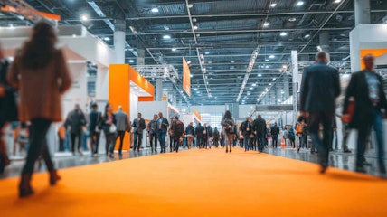
The more friction someone feels when trying to absorb what you’re showing them, the quicker they’ll disengage. That’s true whether they’re online or walking past a stand at a trade show.
Let your layout do some of the talking
Alignment, spacing and visual rhythm are doing more work than you might think. In fact, a well-considered layout often does more to guide a viewer than the text itself.
Group related elements together. Create intentional separation between different ideas. Use grid structures to keep things neat – and break that grid when you need to emphasise something.
And don’t underestimate the power of white space. It’s not “empty” – it’s strategic. It gives your content room to shine.
Match your message to the format
A clever design for an Instagram post probably won’t work at 2 metres tall on a printed display. And vice versa.
Think about how people will encounter your content. Will they be walking past it quickly? Standing in front of it for a few minutes? Scanning it with their phone? Each of these scenarios calls for a slightly different approach to layout.
A roller banner, for example, might need a strong vertical hierarchy with a big, central headline. Whereas a tabletop sign might benefit from more compact, modular sections. If you're planning a larger campaign or a physical presence at an event, it might be worth exploring our full range of visual marketing solutions to see what fits best.
Our Take
Ultimately, a beautifully designed sign or display doesn’t just look good. It feels clear: understandable. easy to engage with. And the secret to that is balance. Not just a balance of elements, but a balance of intention. Visuals that support your message, text that earns its space, and layouts that feel intentional rather than cluttered.
It’s less about rigid rules and more about rhythm. And once you find that rhythm, everything clicks.
posted in How To Guides
Published: | Updated:


Written By:
Noelle Kasparis
Noelle Kasparis is the eCommerce Manager at Display Wizard, a Preston based exhibition stand provider.
With over 15 years of experience in online sales, product management, and brand development, she plays a key role in expanding Display Wizard’s digital presence. Noelle is committed to ensuring the company’s products uphold the high standards of quality that customers expect while driving growth across all online channels.
Share this Event