Trustpilot - Rated Excellent
 Newsletter
What’s in a name? A lot, as it turns out – it is how people will recognise your brand and get to know you. But choosing a name, or the correct wording, for your sign is just the first step in having strong brand recognition. Another, perhaps equally important step is selecting the correct font.
It might seem like an overwhelming task, with so many fonts to choose from. Here, we seek to narrow it down by explaining why font matters, factors to consider, where certain fonts may be more appropriate than others and what are the best fonts for signs.
Keep it clear
You may be tempted to go with an italic or handwriting style of font for your sign, but keep in mind that your sign may need to be viewed from a distance.
A sign that will be seen in close up in a shopping centre can afford to have a slightly less striking font than a sign outside.
If you want a display stand or sign for an exhibition or indoor event, you can go for a simple font such as Arial, as it is easy to read.
But a sign to advertise a sale or event will need to work on a large scale. You will also be able to play with background colours rather than just plain white.
Too many Fonts?
If you are struggling to choose between two or more fonts, it can feel like a good idea to use multiple fonts on one sign. However, there can be a real case of ‘too much of a good thing’ with fonts.
Putting more than a couple on a sign can result in the sign looking cluttered, so your message gets lost.
The best way forward is to either stick with one uniform font for your entire sign, or at the most choose two.
This can work if you have a large word or two to catch the eye (the name of your business, for example, or ‘SALE!’) in a bold font, and the information that a potential customer, visitor or client might need underneath. You should still try to keep the styles similar, so as not to confuse the eye.
Colour Theory
When you’re working with signs, colour factors in heavily. While classic black letters on a white background offers a stark and arresting visual, and the best clarity, you might want something with a little more of a pop.
For example, perhaps you have a company colour scheme you want to adhere to.
Be careful, though. You want to make sure that there is enough contrast between the background and font colour so that they do not blend together and make your message illegible.
As ever, clarity is key when it comes to written information.
UPPERCASE or lowercase?
You may not have thought of this yet, but the case of your letters is very important.
If you want to capitalise a single word all in uppercase, this looks great, with lowercase working for longer bodies of text.
Whatever you do, don’t mix the two up. This rarely looks attractive and can be very difficult to read.
Design matters
Once you have chosen your font and what you want to say, make sure that you think about the layout. Choosing the size of your letters, where you place the words, if you bold or italicise certain words – all of this has a big impact on the visual effect of your sign.
You would not want a big block of copy on a sign advertising a great new deal, nor would you want the whole thing to be in bold. For many signs such as flags and advertising banners, people may only get a split-second glimpse of the message, so keep the text short and snappy!
Think about what looks good and develop an eye for design to create beautiful, effective signage.
Our Favourite Fonts for Signs
So just what are the best fonts for signs? Some that are nearly universally appealing, clear and clean to the eye?
Depending on your needs and what you want to highlight, you would be wise to choose one of these popular fonts for your sign.


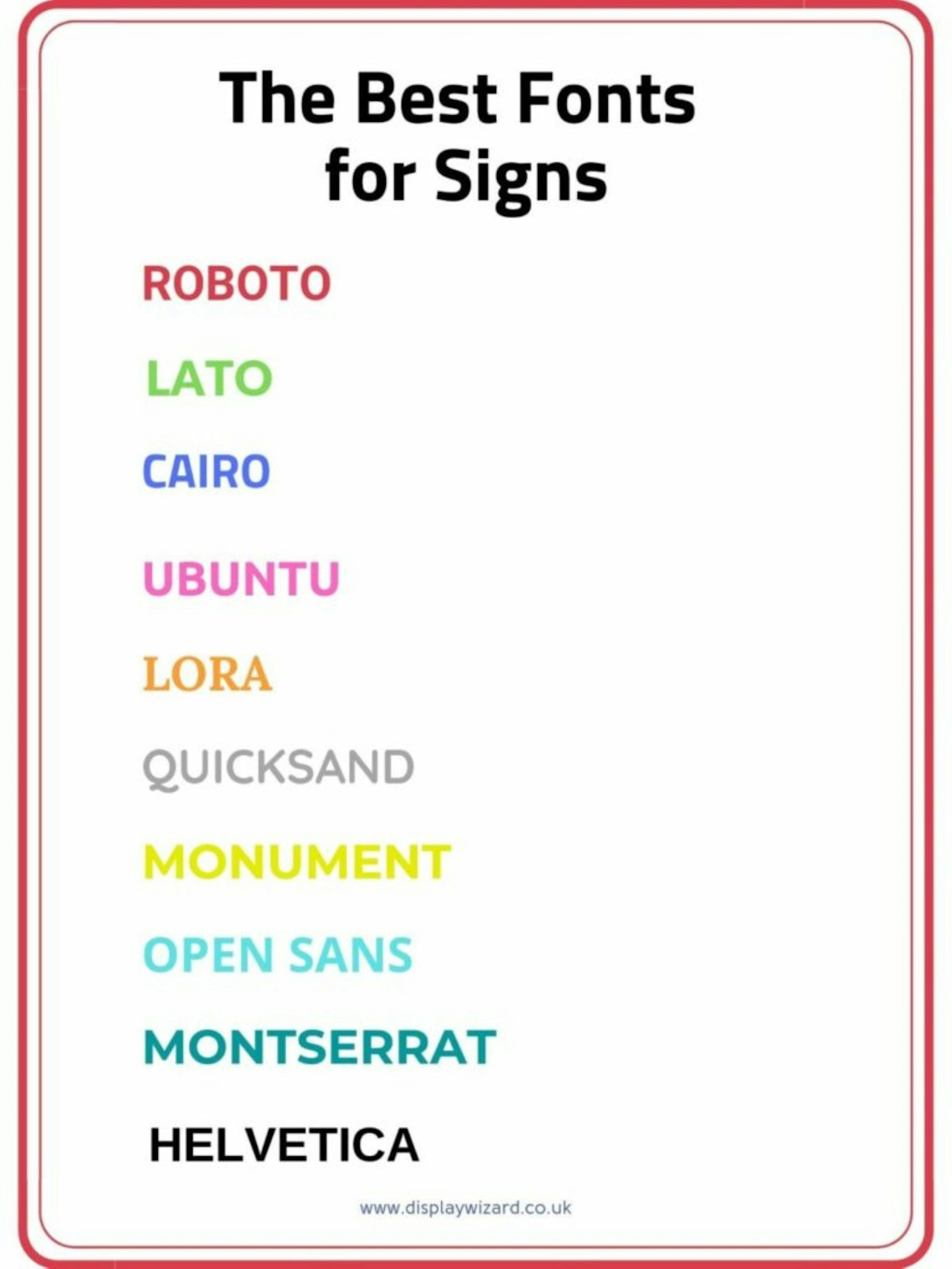
In no particular order, the best fonts for signs are:
Roboto
Lato
Cairo
Ubuntu
Lora
Quicksand
Monument
Open Sans
Montserrat
Helvetica
Feel free to use the graphic on your site, with a credit to www.displaywizard.co.uk.
Which Font will you Choose?
Are you ready to select your perfect font for your sign? There is an excellent range out there to create the ideal look and feel for your brand.
If you are unsure where to start, Display Wizard have an in-house graphic design team that can use their extensive knowledge to pick the right font for you.
Take a look at our selection of pavement signs, pop up displays and outdoor signage such as flags or get in touch to discuss your next sign today.
posted in Marketing Advice
Published: | Updated:


Written By:
Matthew Pavli
Matthew Pavli is a Digital Marketing Consultant at Display Wizard, a UK-based supplier of professional banner stands, pop up displays and exhibition stands. He helps entrepreneurs and businesses across the country stand out at trade shows and events.
Share this Event