Trustpilot - Rated Excellent
 Newsletter
Let’s talk about white space.
No, not blank space, Taylor Swift fans.
How to Utilise White Space for Cleaner and Impactful Designs
Let’s be honest - most bad design isn’t bad because of the colours, the fonts, or even the layout. It’s bad because it’s trying too hard. Like that one guy at a networking event who talks at you without pausing to breathe.
Despite what some people think, it’s not wasted space. It’s not lazy. And it’s definitely not just for minimalists with Helvetica obsessions. When used properly, white space is one of the most powerful tools in your design arsenal.
What Actually Counts as White Space?
Short answer? Anything you don’t fill. Margins, padding, the gaps between lines of text or images, even the dead space around a button - that’s all white space.
It doesn’t have to be white either. Black, beige, hot pink - doesn’t matter. It’s not about the colour, it’s about the function. White space isn’t empty. It’s intentional. It helps people focus, process, and remember. Think of it as the thing that makes everything else make sense.
Why Clutter Happens (and Why It’s a Problem)
Clutter creeps in when you try to say too much at once - or when you’re afraid of being boring. But throwing every idea, every image, and every call-to-action onto the screen doesn’t make something exciting. It makes it overwhelming.
Your audience doesn’t want to fight their way through a wall of noise. They want clarity. Direction. A feeling that you’ve thought about how they’re going to experience what you’ve made.
Where to Start (Without Deleting Half Your Content)
You don’t need to Marie Kondo your design into a single headline floating in the void. Start small. Add a little more breathing room between sections. Widen your margins. Bump up line spacing so text doesn’t feel crammed in like it’s on a cheap leaflet.
Look at your layout and ask yourself: If I took something away, would it make the rest stronger?
Nine times out of ten, the answer is yes.
Let White Space Guide the Eye


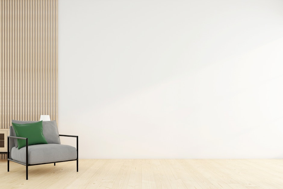
Here’s where it gets clever. White space doesn’t just make things pretty - it controls focus. You can use it to guide the viewer from one section to the next. To create contrast. To highlight a headline, or draw attention to a product shot, or just make something feel more premium.
Luxury brands have known this forever. That’s why their websites feel clean and elegant, even when they’re selling you lipstick that costs more than your rent.
Want that effect without a £2,000-a-day art director? Master white space.
But Doesn’t That Mean… Less Content?
Maybe. But also: who said more is better?
A more spacious layout doesn’t mean you’re saying less - it means you’re saying it with more clarity. More confidence. More... style.
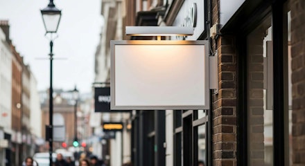
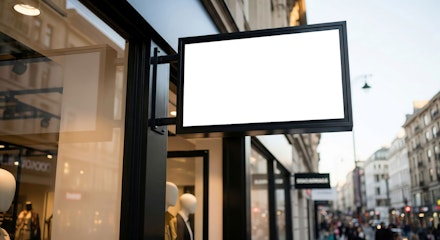
And if you’re really worried about making an impact with less on the page, try using backlit visuals for high-impact displays. They command attention and look gorgeous in a clean layout. White space and bold lightboxes? A match made in visual heaven.
A Few Practical Tips
Don’t be afraid of empty corners. Not everything needs to be filled.
Increase padding around buttons and CTAs. Let them breathe.
Use line breaks to break up dense text. Like this one.
Trust the grid - but break it if the visual rhythm needs it.
Basically: give everything space to shine.
Our Take
If your design feels off and you can’t put your finger on why - start with the space around things.
The difference between “fine” and “wow” is often just a few pixels of breathing room.
And if you’re designing something from scratch, or even planning a full visual identity, don’t forget to check out our guide to designing a logo. Because white space isn’t just for layouts - it’s one of the key ingredients of timeless branding, too.
Give your design a second to exhale. It might be the thing that makes someone stop scrolling and actually pay attention.
posted in How To Guides
Published: | Updated:


Written By:
Noelle Kasparis
Noelle Kasparis is the eCommerce Manager at Display Wizard, a Preston based exhibition stand provider.
With over 15 years of experience in online sales, product management, and brand development, she plays a key role in expanding Display Wizard’s digital presence. Noelle is committed to ensuring the company’s products uphold the high standards of quality that customers expect while driving growth across all online channels.
Share this Event