Trustpilot - Rated Excellent
 Newsletter
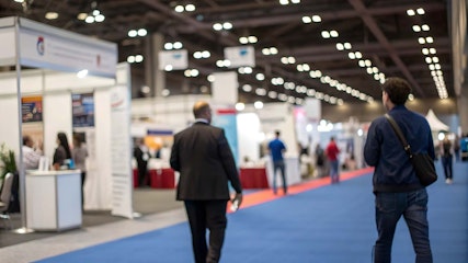
A cluttered trade show booth doesn’t just look messy - it works against everything you’re trying to achieve. When visitors are surrounded by competing visuals, stacks of brochures, an overwhelming number of products, or oversized displays, their attention becomes scattered. And once attention scatters, your core message gets lost.
The most effective booths are intentional. They guide the eye, create breathing room, and prioritise clarity over quantity. Minimising clutter isn’t about stripping everything back to the bare minimum - it’s about presenting what matters in a way that feels organised, welcoming, and easy to understand. Here’s how to get there.
Start With a Clear Purpose
Clutter usually appears when exhibitors try to communicate too much at once. Before designing anything, define the single most important thing you want visitors to notice or remember. This focus acts as your filter.
Once your goal is set, examine every element you plan to include - signage, product samples, digital screens, demo stations. If it doesn’t support the core message, reconsider its place. Booths with a defined purpose feel coherent from the moment someone walks in.
Limit Your Messaging to Essentials
Lengthy text blocks, multiple taglines, and long lists of features create visual noise. At a trade show, people absorb information quickly and often from a distance. So, make sure that you keep your messaging short, sharp, and strategically placed.
Use headlines that communicate value at a glance. If you need more space to explain benefits, consider digital touchpoints or QR codes that take visitors to detailed content. This keeps your physical booth clean while still making deeper information accessible.
Use Layout to Control Flow
A good booth layout naturally guides visitors through the space. Poor flow creates traffic jams, awkward bottlenecks, and areas where people don’t know where to stand or look - all of which contribute to the feeling of clutter.
When planning your design:
Keep pathways open.
Avoid placing large items near the entrance.
Create zones for different types of engagement (viewing, speaking, interacting).
Position hero products or screens where they’re immediately visible.
This makes your booth feel organised rather than cramped, even when footfall is high.
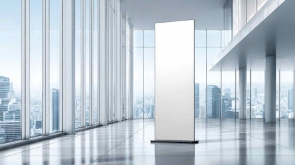
Choose Fewer, Better Visual Elements
One common mistake is trying to display every banner, every product variant, every image, and every graphic all at once. Instead, curate what you show. Choose visuals that best support your message rather than trying to cover every angle.
Large-format graphics work particularly well. They provide a strong visual impact without adding clutter because a single, carefully designed graphic can replace a series of smaller, competing elements.
If you rely on physical displays, focus on versatility. Roller banners, for example, can help maintain structure without overwhelming a space. Display Wizard’s event-ready banner display options are designed for this kind of clean, streamlined presentation.
Use Furniture and Storage Strategically
Mess often accumulates on tables, counters, and demo stations. Loose cables, brochures, drinks, and giveaways quickly make the space look untidy. The solution isn’t more furniture - it’s smarter furniture.
Choose pieces that double as storage so you can hide spare stock, personal items, and equipment. Keep surfaces as clear as possible. A tidy environment builds trust and encourages visitors to look at what’s important rather than trying to make sense of the chaos.
Let Lighting Do Some of the Work


Lighting can make even a minimalist booth look thoughtful and composed. It draws attention to focal points and gives the space definition.
Use spotlights to highlight key areas and products. Softer lighting for background spaces prevents visual overload. The contrast between light zones naturally directs visitors without signage shouting for attention.
Well-planned lighting also replaces the need for excessive decoration. A clean booth with smart lighting often looks more polished than a decorated booth with poor illumination.
Use Digital Displays With Intention
Screens help reduce clutter when used correctly because they replace multiple static graphics with one adaptable surface. A single looping video can communicate more effectively than five printed posters.
But digital elements can create clutter when there are too many of them or when content is busy, fast-paced, or mismatched in styling. Keep video content simple, visually consistent, and slow enough to absorb. A calm digital presence adds sophistication without overwhelming the senses.
Master the Art of Using White Space
White space can help you define hierarchy, emphasise key messages, and give the eyes room to rest. Booths that ignore white space often feel crowded even when they don’t contain many elements.
Understanding how to apply breathing room across graphics and layout is essential for creating a clean booth environment. If you want to explore this idea further, Display Wizard has a helpful guide on using white space effectively.
Applied well, white space immediately makes your booth look more modern and more premium.
Display Products With Discipline
If you sell physical products, it can be tempting to showcase every model or variation. But too many choices lead to decision fatigue. Instead:
Display hero products only.
Keep backups in storage.
Use digital catalogues for extended ranges.
This approach prevents clutter while still giving visitors the information they need. It also makes your stand look selective and confident.
Prioritise Easy Navigation
Visitors should immediately understand where to go, what to look at, and how to move through your booth. If people hesitate at the entrance or look uncertain, the layout is working against you.
Keep entrances wide and obvious. Ensure your main message is readable from several metres away. Arrange your displays so people aren’t forced into awkward corners or blocked paths. A navigable booth feels spacious even when it’s compact.
Final Thoughts
A streamlined booth communicates professionalism, confidence, and intention. It shows visitors that you’ve thought carefully about their experience and that you understand how to communicate your message efficiently.
By controlling layout, refining visuals, limiting messaging, and using tools like lighting, digital displays, and banners strategically, you can create a trade show presence that feels open, welcoming, and easy to navigate.
posted in How To Guides
Published: | Updated:


Written By:
Peter Symonds
Peter Symonds is Managing Director at Display Wizard, a Preston based display and exhibition stand provider.
He has over 15 years of experience in the large format print and exhibition industry and has helped grow Display Wizard into one of the UK's leading provider of high-quality display solutions.
Share this Event