Trustpilot - Rated Excellent
 Newsletter
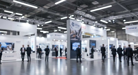
Trade shows reward those who stand out. But if you’ve been allocated a booth that feels closer to a cupboard than a showroom, the challenge intensifies. Limited square footage demands ruthless organisation, clever design, and an eye for detail. A small booth can either fade into the background or, with the right approach, become a sharp, concentrated showcase that leaves a lasting impression.
The trick isn’t about pretending your space is larger than it is. It’s about ensuring every centimetre works to your advantage - visually, practically, and strategically. Exhibitors who master this not only attract attention but often look more professional than those drowning in unused space.
Why Small Booths Can Still Deliver Big Impact
It’s tempting to assume that size equals success. Bigger displays, louder screens, towering signage - surely they dominate? Sometimes they do. But not always. Not only is a compact booth easier to manage, but it forces a brand to strip back the noise and focus on clarity. When executed well, this restraint can be more engaging than sheer scale.
Visitors rarely want to wade through clutter. They want a message they can absorb quickly, ideally in a glance. And a small stand, by its very nature, pushes you towards simplicity. That simplicity, paired with striking design, often resonates more than an overstuffed layout.
How Can You Design A Booth That Feels Larger?
Psychology matters here. Certain visual tricks - lighting, layout, vertical space - change how people perceive size. If the booth feels open and bright, visitors instinctively relax and engage. If it feels cramped, they keep walking.
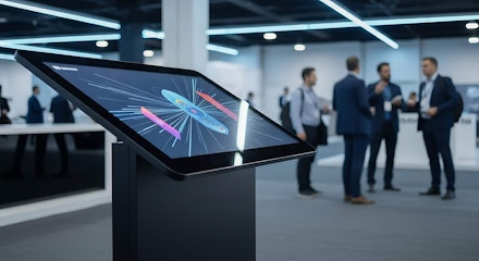
One of the most effective choices is lighting. Static banners are useful, but backlit visuals that stand out indoors do more than illuminate text. They create depth, highlight focal points, and instantly lift the overall aesthetic. In many cases, they make a modest booth look purpose-built rather than improvised.
Then there’s height. Too many exhibitors forget that vertical space counts as much as floor space. Shelving, tall graphics, or hanging signage allow you to draw the eye upwards, giving the illusion of more room. And because most attendees scan an exhibition hall visually before stepping closer, verticality ensures you’re noticed even from a distance.
What Role Does Organisation Play?
A small booth punishes disorganisation. One misplaced box or tangled cable can throw the entire look off balance. Not only is clutter unattractive, but it signals a lack of preparation. Attendees pick up on that instantly.
Organisation isn’t just about hiding storage - it’s about creating a logical flow. Where do visitors enter? What do they see first? Is there space for them to stop without blocking others? These questions should guide your booth plan.
And it goes deeper. Staff positioning matters. Two team members standing in front of a table can accidentally form a barrier. Reposition them slightly to the side, and suddenly the booth feels welcoming rather than closed off.
Which Visual Elements Make The Strongest First Impression?
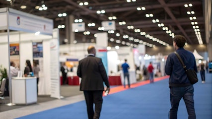
Trade shows are environments overloaded with stimuli. Bright colours, flashing screens, constant chatter. To break through, your visuals need precision.
Here’s where restraint becomes strategy. Too many graphics compete with each other; too few leave the booth looking empty. The balance lies in one or two powerful visuals, backed by concise copy. Think bold headline, strong image, uncluttered design.
Of course, digital screens can help, but they’re not essential. A clear banner, a single oversized product image, or a striking lightbox often works harder than looping videos that nobody stops to watch.
Can Furniture And Layout Change Visitor Behaviour?
Absolutely. Layout decides how long people stay. If the booth feels like a waiting room, attendees shuffle out quickly. If it feels interactive, they linger.
Tables positioned at the front can act like a wall. Push them back, or use high tables that invite standing conversation instead. Compact stools or foldable chairs work better than bulky seating. And wherever possible, create one small focal area - whether that’s a product demo zone or a digital display - so visitors naturally gather without clogging pathways.
Not only does this make the booth functional, but it encourages more meaningful conversations. People who sit or stand comfortably are far more likely to listen, engage, and remember your pitch.
What About Branding Consistency?


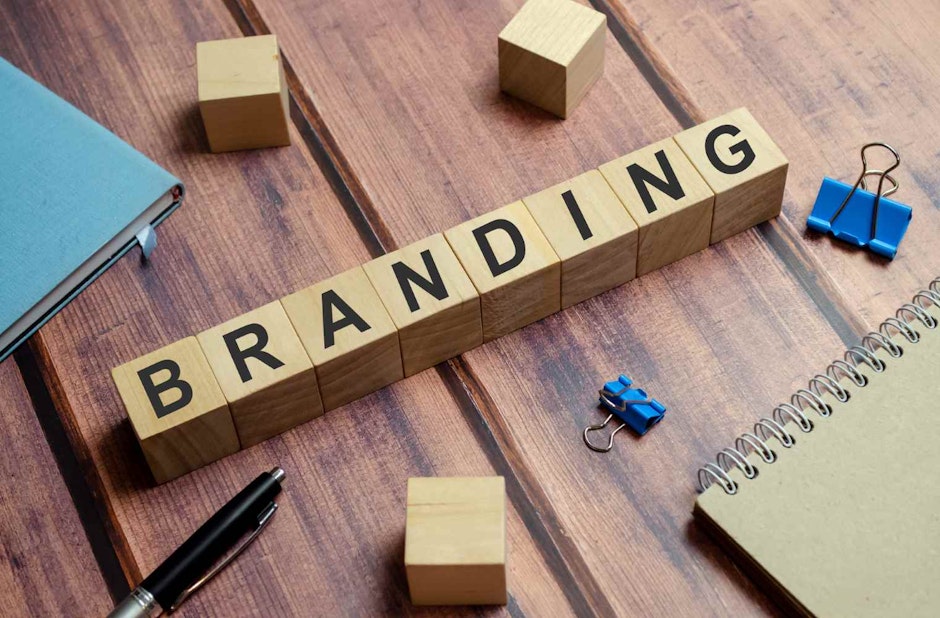
Even the sharpest layout fails if the branding feels disjointed. Small booths magnify inconsistency. A mismatched logo here, an off-colour banner there - it stands out more in a confined space than it might in a sprawling stand.
Consistency doesn’t mean flooding the booth with logos. It means aligning everything - fonts, colour schemes, messaging - so the space feels unified. Done well, it signals professionalism. Done poorly, it suggests shortcuts.
How Do You Draw Attention In A Hall Full Of Competitors?
At some point, even with perfect organisation, you need a hook. This doesn’t mean gimmicks. It means relevance. Something that makes attendees pause because they recognise value.
Sometimes it’s product-led: a live demo that answers a problem many in the industry face. Sometimes it’s design-led: clever signage that sparks curiosity. Or sometimes it’s practical: free charging points, small giveaways that are actually useful, not just branded clutter.
But underpinning all of this is visibility. Without it, your booth vanishes. Techniques for boosting your booth’s visibility at events are worth considering long before the show opens - because even the best layout means little if nobody sees it.
When Is Less Actually More?
Minimalism has its risks. A booth stripped down too far can look empty. Yet when carefully balanced, less really can be more. Sparse design makes space feel larger. It ensures your key message doesn’t drown in noise.
The irony is that many small stands outperform bigger ones for this reason alone. Attendees don’t want to be overwhelmed. They want clarity. And a restrained, focused booth provides exactly that.
The Bottom Line
Small booths don’t have to be a disadvantage. With clever design, sharp organisation, and disciplined branding, they can be powerful. Not only do they often force clarity, but they also stand out precisely because they’re not trying to do everything at once.
The key lies in choices: using light intelligently, building upwards, keeping clutter at bay, and ensuring every element earns its place. Done right, the booth stops being “small” in the eyes of visitors. It simply becomes effective.
posted in How To Guides
Published: | Updated:


Written By:
Peter Symonds
Peter Symonds is Managing Director at Display Wizard, a Preston based display and exhibition stand provider.
He has over 15 years of experience in the large format print and exhibition industry and has helped grow Display Wizard into one of the UK's leading provider of high-quality display solutions.
Share this Event