Trustpilot - Rated Excellent
 Newsletter
Marketing doesn’t work without emotion. Logic might justify a purchase after the fact, but it's feeling - immediacy, curiosity, desire, even nostalgia - that drives action. Visuals tap into that instinct fast. Before someone reads a single line of copy, their eyes are already forming an opinion. And once that impression sets in, it’s difficult to reverse.
This is why visuals aren’t just decoration. They’re functional tools for emotional influence. Used well, they can anchor a campaign. Used poorly, they dilute everything else. So what actually makes a visual emotionally effective?
Why Emotionally-Driven Visuals Work
Images bypass rational filters. They don’t wait for analysis. A moody colour palette, a facial expression, a sense of motion - they land hard and fast.
There’s biology behind this. Visual stimuli hit the amygdala (the brain’s emotional processing centre) before the information even reaches the prefrontal cortex. Translation? You react emotionally before you process meaning.
And from a marketing standpoint, that matters. Because when a viewer feels something - recognition, aspiration, even FOMO - they’re far more likely to take action. Not just engage, but convert.
Still, this isn’t about manipulating emotions blindly. It’s about choosing the right ones - and aligning them with brand truth.
The Visual Elements That Trigger Emotion
Emotion isn’t tied to one specific style or template. But certain visual elements consistently provoke strong responses:
Colour: Not only does colour set the tone instantly, but it subconsciously shapes perception. Think soft pastels for calm, bold reds for urgency, deep blues for trust. That’s why choosing the right brand colours is foundational, not optional.
Facial expression: Eye contact, subtle tension, a smile or a smirk. Human faces are magnetic and highly emotive. Even abstract or surreal designs can incorporate implied facial cues to draw attention.
Composition: The way elements are spaced and balanced either creates ease - or discomfort. Symmetry feels stable. Asymmetry adds drama. White space can calm, while tight framing creates urgency.
Texture and lighting: Harsh shadows can unsettle. Soft glows can soothe. Flat graphics might feel modern, but can also read as impersonal if misused.
Movement: Whether literal (animation, video) or implied (angled lines, blurred edges), movement adds energy. It also directs the viewer’s gaze - guiding them through the story you’re telling.
But these components can’t just be thrown together. Visuals need to speak the language of the audience - and reflect what the brand actually stands for.
Matching Visual Tone With Brand Identity
A startup offering trauma therapy shouldn’t lean into hyper-saturated neons and chaotic typography. Just like a youth fashion label probably shouldn’t opt for grayscale minimalism.
It’s not about being “on-trend.” It’s about emotional coherence.
When the visual tone clashes with the brand message, trust erodes. But when it aligns? It creates resonance. People feel understood - even if they can’t explain why.
This is where many campaigns fall flat. They over-rely on aesthetics and forget the emotional undercurrent. A polished visual with no heartbeat won’t connect.
So before choosing visuals, the real question is: what do you want people to feel? Not what you want them to know. What you want them to feel the moment they land on that page, scroll past that ad, or glance at that packaging.
The Role of Context and Environment


A stunning visual can still fall short if it doesn’t respect its environment.
Here’s the thing: the same image can evoke wildly different emotions depending on where and how it’s seen. A bold visual on a cluttered feed might get ignored. But on a minimalist landing page? It commands focus.
That’s why context isn’t secondary - it’s part of the emotion itself.
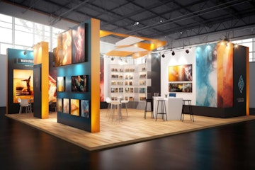
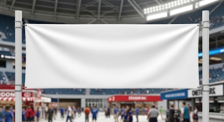
This also applies to physical assets. Something like a retractable banner system at an expo isn’t just a backdrop. It’s a high-stakes visual moment. In a noisy setting, it has to cut through and evoke curiosity instantly - otherwise, foot traffic walks right past.
Tone, timing, placement - these aren’t just logistical decisions. They’re emotional ones.
Avoiding Visual Overkill
It’s tempting to flood a design with meaning. To inject symbolism, colour psychology, dynamic layouts - everything, all at once.
But overloading visuals kills clarity. Worse, it blurs the emotional signal.
In fact, restraint often creates more impact. A single compelling image can communicate far more than a collage of over-thought elements.
Think of iconic campaigns: Apple’s early iPod ads, Dove’s Real Beauty portraits, Nike’s stripped-back athlete close-ups. None relied on complexity. They trusted the emotional clarity of the visual.
Testing Emotional Impact (Without Guesswork)
Not all emotional responses are universal. What triggers nostalgia for one demographic might seem irrelevant to another. That’s why testing matters - not just A/B layout testing, but emotional response testing.
This doesn’t mean turning every campaign into a focus group. But basic behavioural data - like scroll depth, dwell time, bounce rate - can reveal a lot about how well a visual landed.
If the audience doesn’t stop to look, doesn’t linger, doesn’t click - it didn’t work. Not emotionally. And that’s the benchmark that actually matters.
Final Thoughts
Not only do visuals shape perception, but they anchor emotional engagement. And that engagement is what turns passive viewers into active customers.
Effective visuals aren’t just beautiful - they’re purposeful. They understand the viewer’s psychology, speak to their instincts, and guide their reactions.
Whether it's a digital ad, a landing page, or a retractable banner system at a trade show, the goal stays the same: create an emotional connection. Because once someone feels something real? They remember you. And they act on it.
posted in How To Guides
Published: | Updated:


Written By:
Peter Symonds
Peter Symonds is Managing Director at Display Wizard, a Preston based display and exhibition stand provider.
He has over 15 years of experience in the large format print and exhibition industry and has helped grow Display Wizard into one of the UK's leading provider of high-quality display solutions.
Share this Event