Trustpilot - Rated Excellent
 Newsletter
Every business wants its banners to stand out - whether at trade shows, exhibitions, or shopfronts. And yet, many designs fail to hit the mark because of easily avoidable errors. Some are technical, tied to resolution or file format. Others are strategic, like using weak messaging or mismatched colours. The result is the same: a banner that doesn’t do its job. Let’s break down the pitfalls that most often trip people up and look at how to avoid them.
Why Do Printing Errors Happen So Often?
It might seem strange that, in an age of high-quality printers and digital design tools, mistakes still slip through. But consider the process: multiple people involved, from designers to printers, each with their own priorities. Deadlines tend to be tight, meaning corners are cut. And small oversights - like ignoring bleed areas or relying on low-resolution files - quickly snowball into costly outcomes.
Not only are these mistakes frustrating, but they also weaken the very purpose of the banner: to draw attention, inform, and persuade. A blurry logo or misaligned graphic sends a message of carelessness, even if that wasn’t the intention.
Poor Image Resolution
Resolution is the most basic, yet most common, issue. People often design banners using images optimised for web use. They look fine on screen, but when enlarged to several feet wide, pixelation becomes unavoidable.
The truth is, printers need files at 150–300 DPI at final size to deliver sharp results. Anything lower risks fuzziness. And while some assume that “upscaling” an image will solve the problem, software can’t create detail that isn’t there. Better to source high-resolution images from the outset.
Ignoring Bleed And Safe Margins
A banner isn’t just the flat artwork on your computer screen. It’s a physical product, with edges trimmed, eyelets punched, hems folded. Designers who neglect bleed areas often find that text or graphics get cut off.
A simple rule avoids this: extend the background beyond the trim line (the bleed), and keep key elements well inside the safe zone. That way, even with slight shifts in cutting, nothing important disappears. It sounds obvious, but rushed jobs often miss it.
Overcrowded Design
There’s a temptation to cram every possible detail onto a banner: slogans, contact info, product lists, graphics, logos. The result? Visual overload. Viewers don’t know where to look, and the message gets lost.
Not only is an overcrowded layout unattractive, but it actively undermines communication. A banner must work at a glance - clear, simple, and memorable. Prioritise one or two key messages. Supporting details can live elsewhere, such as in brochures or conversations at the event.
Colour Mistakes That Undermine The Message


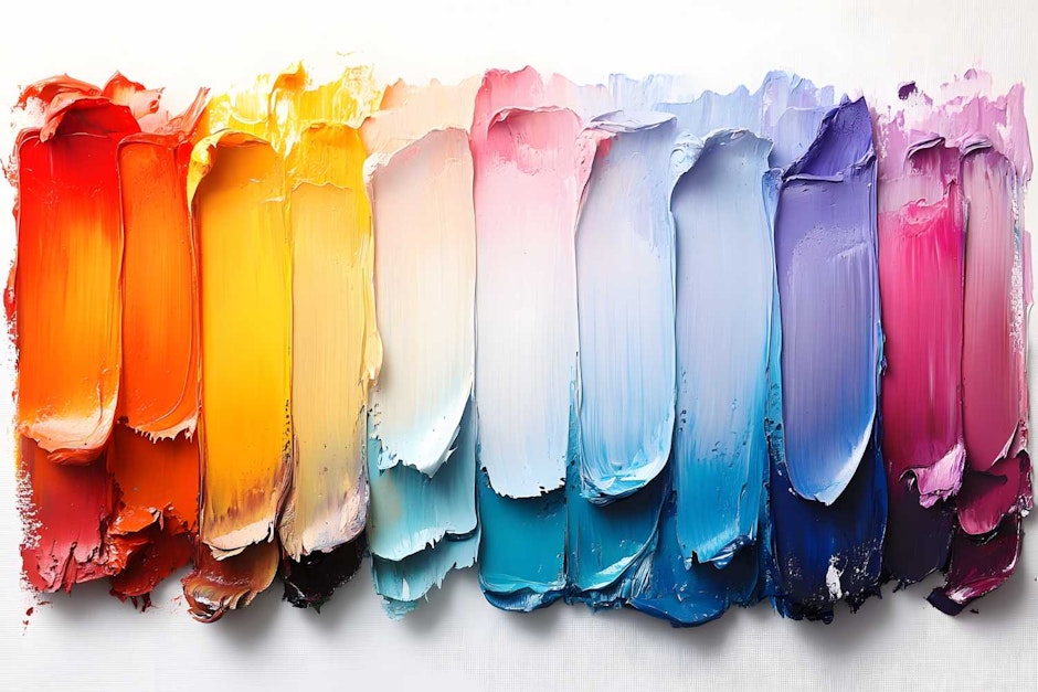
When it comes to choosing impactful brand colours for banners, colour is more than decoration. It shapes perception, creates contrast, and ties back to brand identity. Yet colour problems are rampant. Some stem from technical differences between screen (RGB) and print (CMYK). What looks bright on a monitor can dull on vinyl. Others come from poor choices - clashing tones, low contrast between text and background, or colours that don’t align with brand guidelines.
Weak Hierarchy Of Information
Even a banner with strong visuals can fail if the hierarchy of information is muddled. Think about how the eye moves: it should land first on the main headline or logo, then flow naturally to supporting details.
Without clear hierarchy, the banner feels flat. For example, if a call to action is buried in small text, the audience misses it. Size, weight, and placement all matter. It’s not about artistic preference but about guiding attention deliberately.
Choosing The Wrong Material Or Finish
A design that looks perfect on screen can flop if printed on unsuitable material. Indoor paper banners fade or crinkle outdoors. Glossy finishes create glare under harsh lighting. Thin vinyl may sag over time.
Not only is the wrong material a waste of money, but it also projects the wrong image of your brand - literally and figuratively. The right choice depends on where and how the banner will be used: indoor exhibitions, outdoor street displays, or long-term shopfronts. Consulting with a printer about environment-specific options saves disappointment later.
Forgetting The Context Of Display
A banner doesn’t exist in isolation. It competes with lighting, crowd movement, and surrounding visuals. Too many designs are finalised without considering the actual setting.
Imagine a dark-coloured banner placed against a black wall - instantly invisible. Or a small pull-up used in a huge hall, dwarfed by competitors’ towering displays. Not only does this diminish impact, but it also wastes the investment. Thinking ahead about scale, contrast, and placement makes all the difference.
Common Pitfalls To Keep In Mind
To bring these points together, here are the recurring errors worth remembering:
Low-resolution files lead to blurry results
Neglecting bleed causes cut-off text or logos
Overcrowded layouts dilute the message
Poor colour choices reduce readability and impact
Weak hierarchy hides key information
Inappropriate materials fail in real-world settings
Context overlooked, meaning banners don’t stand out
The Importance Of Display Strategy
Avoiding design errors is crucial, but so is understanding how banners fit into broader marketing. They’re rarely used alone. Often they accompany stands, counters, or signage at events. Selecting the right displays for product launches can therefore elevate the effectiveness of a well-printed banner - a strategic mix signals professionalism and helps audiences connect with the message faster.
And to be fair, sometimes mistakes aren’t glaring. They’re subtle - slightly off colours, or logos placed just a little too low. But these small details accumulate, shaping perception in ways that aren’t easy to measure but definitely felt.
Final Thoughts
Banner printing isn’t complicated in theory, but in practice, it’s full of traps. Not only do technical oversights like low resolution or ignored bleed areas create problems, but strategic missteps - such as overcrowding or weak hierarchy - can undermine communication entirely.
The key is awareness. Understanding how design translates from screen to print, and how banners function in real environments, prevents disappointment. Think high-resolution images, clear hierarchy, strong colour choices, suitable materials, and contextual awareness. Done right, banners become more than background decoration - they become effective tools for visibility, persuasion, and brand presence.
posted in How To Guides
Published: | Updated:


Written By:
Peter Symonds
Peter Symonds is Managing Director at Display Wizard, a Preston based display and exhibition stand provider.
He has over 15 years of experience in the large format print and exhibition industry and has helped grow Display Wizard into one of the UK's leading provider of high-quality display solutions.
Share this Event