Trustpilot - Rated Excellent
 Newsletter
If you’re new to graphic design, you may be struggling to understand the differences between the various colour systems and how each is used.
The use of these systems depend on the type of material you’re printing or displaying your graphics on.
The three main colour systems are:
CMYK
Pantone, and
RGB
It's useful to know how each of these works, and how they differ from one another.
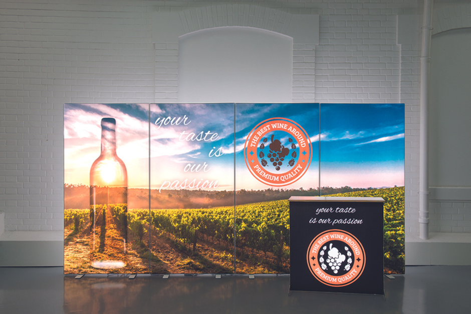
Here we look at the differences between the colour systems, with a special angle on large-format print materials such as exhibition stands. This will make designing your exhibition materials that much more straightforward.


CMYK
CMYK stands for Cyan, Magenta, Yellow and Black.
This colour model is used in printing because it allows the printer to break down artwork for printing into different ink dots.
In the CMYK process, the printer adds one layer of colour at a time, to create the finished colour you desire.
The K in CMYK originally means key. This refers to the old printing presses that used screw keys to decide the concentration of ink required to achieve the desired colour.
You may also find CMYK referred to as full-colour print or 4-colour process.
By printing in CMYK, you can have as many colours as you want in your design without it costing you anything extra.
Typically, CMYK printing is used on paper materials and packaging, but not on plastic materials.
If supplying artwork for large format printed material such as an exhibition stand, there may be additional requirements for any images or completed artwork supplied. Here are ours at Display Wizard:
Supplied at 25% of the finished size (template will be provided)
All images at 300dpi
Supplied as a high-resolution PDF with all images embedded and fonts
Pantone
The Pantone Matching System (PMS) is a comprehensive catalogue of colours created by the Pantone company.
The idea is that by using the Pantone system, you can find a specific colour that you wish to use.
This is especially useful when it comes to branding. By applying Pantone colours to your brand, you create a clear visual identity that you can reproduce accurately in print.
You can use Pantone colours in your company logo and other promotional material to tie everything together visually.
The printing process is different from CMYK because you're not mixing the colours to achieve results.
Printers can print up to five or six Pantone colours in a design. Typically, though, you would use fewer unless you had a particularly complex logo or brand identity.
You can use Pantone to print on paper materials but also on plastics. Pantone is useful for printing non-paper exhibition stand materials, as well as things like transport liveries.
It ensures accuracy in colour reproduction and, therefore, consistency in your branding.
However, it’s likely to add cost to your printing, especially if you want to use more than one or two Pantone colours, as the printer will have to add these separately, on top of CMYK.
As standard, at Display Wizard we convert all pantone colours to CMYK for the printing process for our exhibition stands.
RGB
The RGB system stands for Red, Green and Blue. This is the colour system that allows computer monitors and other electronic screens to output colour displays.
These colours are also known as hexadecimal or hex-colours.
Basically, the light source in an electrical device can create any colour by combining red, green and blue.
The different intensities of these colours will determine how the final colour looks on the display. This process is additive mixing.
To arrive at the colour you want, you add different numerical RGB values on top of black to create the desired pigment.
The more colours you apply on top of each other, the brighter the result. If you add no colours, you have pure black. If you add all the colours you get pure white.
RGB is a versatile system for creating a very broad range of colours digitally or electronically. In fact, it’s the only colour system for displaying colour on websites, in videos and in electronic images.
RGB is best for digital devices such as computer monitors and typically does not transfer well to CMYK for printed materials as the colours can look muted.
Which Colour System Should You Use?
If you’re designing an exhibition stand, you’re going to need to know about different colour systems required for large-format print design as well as setup for marketing material such as leaflets, flyers and posters.
You may also have branded digital displays. These too will involve colour.
For printed materials, it’s best to use CMYK. You’ve also got the option to specify Pantone colours but these will be converted to CMYK.
For paper and plastic materials it’s best to use the Pantone colour system.
For your electronic displays or online material, you’ll need to use the RGB system.
Display Wizard’s range of exhibition stands have templates included for you to easily set up your artwork. However, we are happy to assist with this or design completely from scratch through our graphic design service for our stands.
Please don’t hesitate to get in touch to discuss your exhibition needs. We can help you with a wide range of design elements, including printing with colour.
posted in Marketing Advice
Published: | Updated:


Written By:
Peter Symonds
Peter Symonds is Managing Director at Display Wizard, a Preston based display and exhibition stand provider.
He has over 15 years of experience in the large format print and exhibition industry and has helped grow Display Wizard into one of the UK's leading provider of high-quality display solutions.
Share this Event