Trustpilot - Rated Excellent
 Newsletter
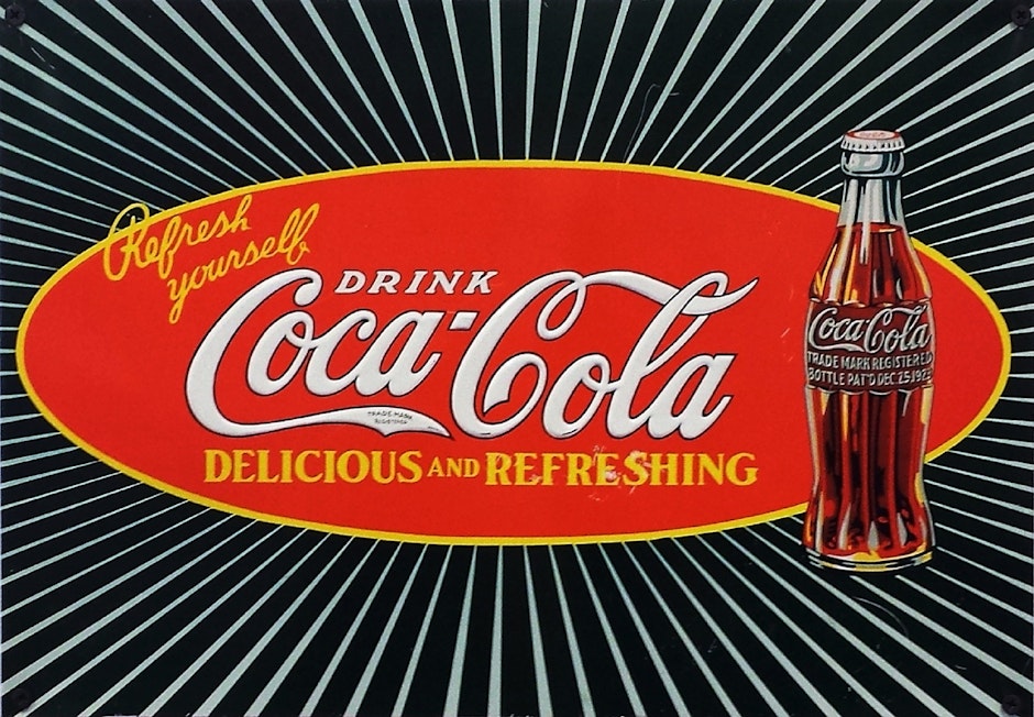
When you read the phrase Coca Cola, what does it bring to mind? For some it might be the satisfying ‘tchhh’ sound when you open a can before taking a sip.
For others it might be the sweet, sticky caramel flavour of the coke itself. Many others again, however, will will see the unmistakable red and white Coca Cola logo come into focus in their minds eye.
Like any effective form of signage, the Coca Cola logo imprints itself deeply onto the memory. This is not just because we see it often in everyday life, or because of the characteristic swirl of the Coca Cola font.
It is because of the colour choice. The red and white colour tones convey a strong message about the Coca Cola brand, connecting with consumers.
Colour choice is hugely important in sign and display stand design. Below we look at why colour symbolism and combinations are important, and provide some tips for using colour effectively.


Colour Symbolism
Colours have symbolic meanings and can incite emotional reactions. This has been proven by recent scientific research, which has shown that different colours can trigger reactions in different parts of the brain. Big brands are aware of this and are therefore very selective about the colours that they use in their signage..
Some colour symbolism is intuitive and seems like common sense. For example, the association of the colour green with health and nature, or the colour red with anger and passion.
However, there are some more subtle associations that might not seem so obvious at first. For example, the association of the colour purple with wealth, orange with optimism and blue with trust. It is important to understand these kinds of less obvious colour-associations because they affect consumers at a more sub-conscious level.
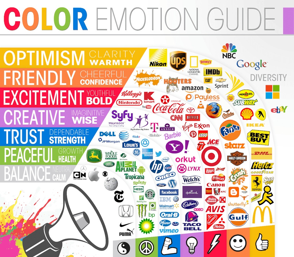
The Psychology of Colour
There are also subtle differences within the hues of individual colours. For example, darker reds used by Coca-Cola, Levis, Manchester United... convey dominance, energy and excitement.
Lighter colour reds however convey a quite different message, evoking love, passion and femininity. Light red is therefore used by beauty brands, such as Clarins.
When choosing colours for your sign, it is therefore important to avoid oversimplifications. Focus on establishing the essence of your brand and the message you want to convey in your logo and signage and then match a precise colour shade to this.
This psychology of colour graphic can serve as a useful tool to make sense of individual hues and find subtle associations that work for your brand.


Colour Combinations
Colour choice for signs is not just about finding a single colour that fits with the messaging of the brand. When designing the sign, you also need to think about colour combinations that work.
Establishing effective colour combinations can be a bit of a minefield. If there are too many colours on a sign it becomes difficult for the brain to organise and interpret the information. The key message of your sign can become lost. So, as a general rule, it is advisable to stick at most three colours.
When deciding how to select and combine different colours, the colour wheel is a useful tool that can help you avoid the pitfalls of clashing colour tones. It differentiates between different hues, which are separated across the 12 segments of the wheel, and between different levels of brightness, separated out as subsections within each segment.
Colours on opposite sides of the colour wheel directly compliment each other. For example, orange compliments blue and green compliments red. You could opt for colours from opposite sides with similar levels of brightness.
Stand Out With Contrasting Colours
However, if you really want your sign to stand out, combine a dark colour from one segment with lighter colours from the opposing segment. This can create a really striking look.
If you like diverse colour tones and want to use three different colours on your sign, you could also opt for split complimentary combinations.
You do this by selecting a main colour from one segment and two colours which are adjacent to the one that is directly opposite.
This approach can make for a more unique look because it increases the range of options at your disposal.
Get Creative with your Brand's Colour Scheme
The best thing about finding the right colour scheme for your sign, is that it provides space for creativity.
So whilst these general rules provide a good guide to effective colour-use, feel free to openly express yourself and your brand and bring your signage to life!
If you require a sign for your business such as a pavement sign, roller banner or pop up display with expert graphic design assistance when needed, please get in touch with Display Wizard.
posted in Marketing Advice
Published: | Updated:


Written By:
Matthew Pavli
Matthew Pavli is a Digital Marketing Consultant at Display Wizard, a UK-based supplier of professional banner stands, pop up displays and exhibition stands. He helps entrepreneurs and businesses across the country stand out at trade shows and events.
Share this Event